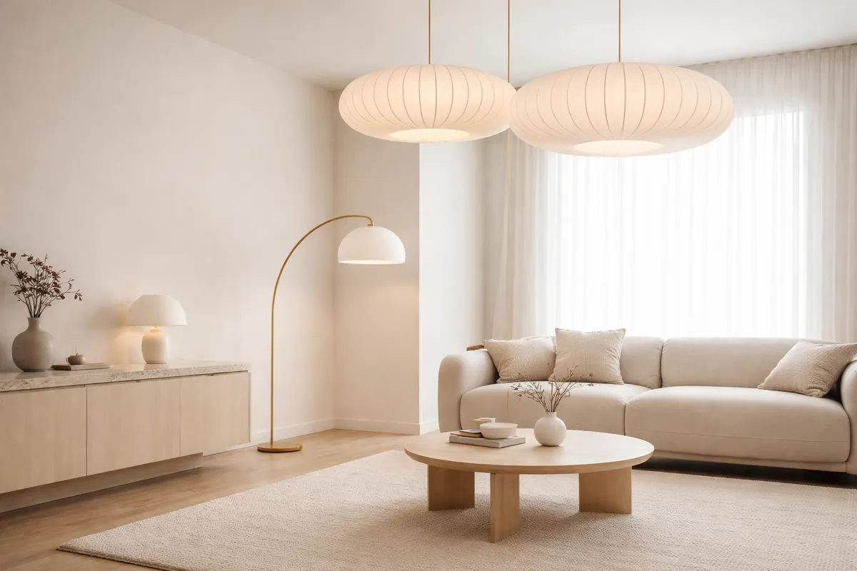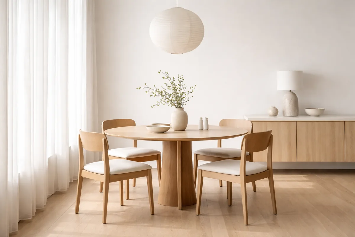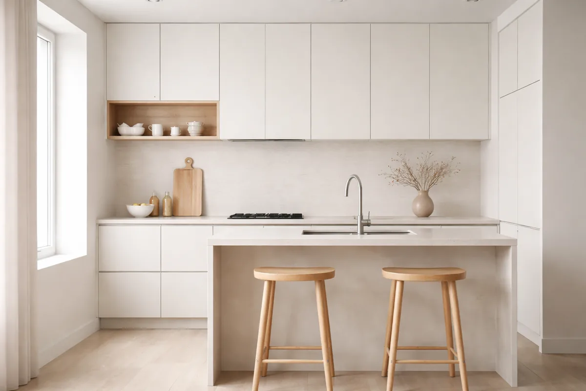
Choosing the right color palette for a minimalist kitchen is essential to achieve the desired aesthetic and ambiance. A well-executed minimalist kitchen often employs a limited color selection that emphasizes simplicity, functionality, and elegance. Popular choices include white, gray, and natural wood tones, creating a calm and organized cooking space.
Understanding minimalist design principles
Minimalism focuses on stripping away the excess and highlighting the essentials in a space. This design philosophy promotes clarity and spaciousness, often reflected in the choice of colors. A palette that leans towards neutral shades creates a clean look while allowing essential kitchen elements, like countertops and cabinetry, to shine. The emphasis on light colors can make spaces feel larger and more open, which is particularly beneficial in a kitchen where movement and functionality are key.
Effective color combinations for a minimalist kitchen
For a minimalist kitchen, choosing colors that complement each other without overwhelming the senses is vital. Here are some effective combinations:
- White and muted gray: This timeless pairing provides a fresh, airy feel. White walls with muted gray cabinets or backsplash create contrast while maintaining a soft, minimalist look.
- Natural wood and off-white: The warmth of natural wood tones combined with off-white creates a welcoming atmosphere. This combination brings a touch of nature indoors while aligning with minimalist principles.
- Black and white: A classic black-and-white palette adds sophistication and drama to a minimalist kitchen. Accentuating key features like a black island or countertops against white cabinetry maintains the simplicity of the design.
- Pale blue and white: For a touch of color, pairing pale blue with white offers a serene vibe. It maintains a light and airy feel while injecting a hint of personality.
The role of textures in color selection
Color in a minimalist kitchen is not solely about hue; the textures involved also play a critical role in enhancing the overall aesthetic. Consider incorporating various materials that complement the chosen colors. For example, pairing a matte white finish with glossy black accents creates visual interest without becoming overwhelming. Textured backsplashes, such as subtle patterns in tile or rough-hewn wood, can add depth and functionality without deviating from the minimalist approach.
How lighting influences color perception
Natural light significantly impacts how color is perceived in a kitchen. A color that appears warm during daylight may look cold under artificial lighting, which is why it is essential to test paint samples in your space. Consider the direction of your kitchen windows and the type of artificial light fixtures you plan to use. Warm LED lights can enhance earthy tones and make a space feel inviting, while cooler lighting can accentuate sleek and modern shades like slate gray or crisp white.
Reviewing trends in minimalist kitchen palettes
While timeless color palettes are foundational in minimalist design, emerging trends can offer fresh inspiration. Soft pastels, muted jewel tones, and earth-toned palettes have gained popularity in recent years, adding a modern twist to traditional minimalist aesthetics. Colors such as sage green or terracotta can provide a splash of color while still feeling relaxed and unintrusive, aligning with minimalist ideals. Additionally, incorporating non-traditional colors for cabinetry or walls, like dark navy or a gentle lavender, can create a stunning focal point that maintains minimal interference with the overall scheme.
Sample color palettes for your minimalist kitchen
| Color | Description |
|---|---|
| Soft White | Brightens the space and enhances airy feel. |
| Slate Gray | Adds depth while maintaining neutrality. |
| Natural Wood | Warmth and organic feel, perfect together with light shades. |
| Pale Blue | Serene color choice that adds a calming effect. |
| Charcoal Black | Offers dramatic contrast, ideal for accent features. |
Creating a balanced layout with color
In a minimalist kitchen, balance is key. When selecting colors, consider not only how they interact with each other but also how they work with the overall layout and features of the kitchen. A predominantly light color scheme can make small spaces feel larger but requires careful attention to ensure that darker shades do not overpower the design. Positioning colors thoughtfully—say, using darker shades on lower cabinets and lighter ones above—creates a visual flow that guides the eye and enhances spatial awareness.
FAQ
What are the best colors for a small minimalist kitchen?
Light, neutral colors like white, beige, or pale gray help create the illusion of space and brightness, making them ideal for small kitchens.
Can I add color to a minimalist kitchen without losing the minimalist feel?
Yes, introducing subtle accents—like soft pastels or muted tones—can add character without overwhelming the minimalist aesthetic.
How do I choose the right shade of white for my kitchen?
Consider the lighting in your kitchen; test various whites under different lighting conditions to find the right shade that feels warm and inviting.
Is it practical to use darker colors in a minimalist kitchen?
Darker colors can work well as accents or lower cabinetry, providing depth while maintaining a minimal look when balanced with lighter elements.
What materials best complement a minimalist color palette?
Materials such as natural wood, polished concrete, and matte finishes blend well with minimalist color schemes, adding texture without cluttering the aesthetic.